KSIF distributes KSI Font, a two-type typeface created in celebration of the Foundation’s 10th anniversary.
글쓴이홍보협력팀
태그
작성일 2022-11-17
조회수751
Now, in KSIF
> KSI Font (Title) and KSI Font (Body) released, available for
download from the Foundation’s website.
> Jointly developed by the Foundation, Hancom Group, and Yoondesign
Group.
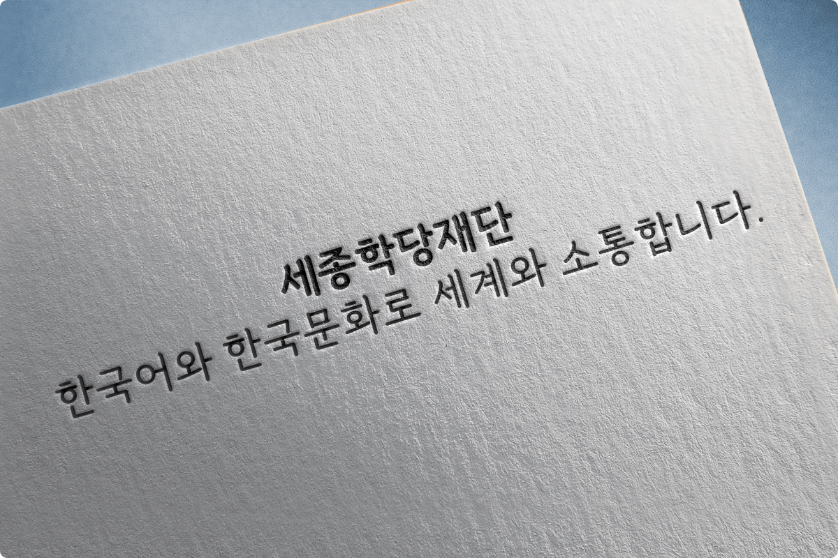
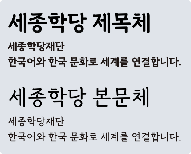
KSIF released KSI Font, a two-type typeface created in celebration of
the Foundation’s 10th anniversary.
KSI Font was jointly developed by the Foundation in March of this year
after signing a business agreement with Hancom Group and Yoondesign
Group, with the goal of spreading the use of the Korean language and
Hangeul in light of the digital era. KSI Font, a two-type font
consisting of KSI Title Font and KSI Body Font, is designed and
structured based on Batang Font, which is used most widely when
writing in Korean and is therefore familiar to people of other
nationalities.
The two types have different thickness and line of writing so that
they can be adopted according to the purpose of use. The title Font is
thicker, with the line of writing being located towards the top for
enhanced focus, whereas the body Font is thinner with the line of
writing located towards the top middle for increased readability. The
KSI Font is relatively round in shape in terms of edges and corners,
and therefore has a handwritten feel, representing the delicateness
and warmth of KSIF.
* line of writing: a virtual central reference line when reading from
left to right.
The Foundation made the two-type Font available for free through its
website, where users can try out the font prior to downloading. In
November, the Font will be added to Hancom Asset, a font platform of
Hancom, so that it can be used on both the installation-type Hancom
Office and the subscription-type Hancom Docs.
Users can download the KSI Font from the Foundation’s website (About
the Foundation → Foundation Overview → KSI Font).


Knock, knock!
Let me tell you the story of King Sejong Institute